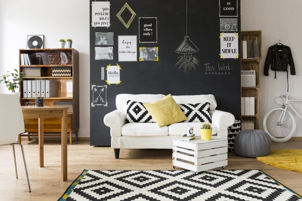
Minimalism had a good run, gracing the homes of many a celebrity, including Kim Kardashian and Kanye West’s Belgian monastery-inspired futuristic home. However, people are starting to veer away from their handleless cabinets and blank walls. The new trend in 2021—and for many years after—according to top interior designers, is maximalism.
It’s not a surprise that homeowners are returning to the wildly beautiful design of yesteryears. In fact, Architectural Digest predicted its comeback in 2020. After years of creating rooms in beige and gray, people now long for brazen color palettes and unforgiving patterns in the very rooms they want to relax in.
So What Is Maximalism?
It’s easy to define maximalism as piling everything in one room all at once. But it’s more refined and complicated than that.
Maximalism is a design movement where people embrace the idea of excess but in a sophisticated and well-thought-out way. It’s neither hoarding nor overstuffing rooms. It’s about using bold color palettes, intricate details, repetition of patterns, and one-of-a-kind décor.
In contrast with the muted hues of minimalism, maximalists lean towards saturated colors; pastels are barely allowed. While minimalists pare the room down to the bare bones, maximalists fill it with unique statement pieces. In minimalists homes, like goes with like — books-only shelves, record-only nooks, etc. In maximalism, every corner mixes books, artwork, and everyday items.
Minimalist homes almost always look the same. Maximalism offers no limits. Your kitchen can look like a Victorian drawing room, an all-day breakfast café, or a chic seaside restaurant.
Here are other elements of a maximalist space:
- Different items have the same patterns (florals, animal prints, etc.)
- The room mixes different styles (futuristic with boho elements)
- The space has a lot of textures (fur rugs, velvet couches, metal sculptures, etc.)
- There’s no shortage of décor (wallpapers, photos, sculptural furniture, etc.)
Inject Maximalism into Your Home
When designing a maximalist home, it’s easy to go overboard. If the pieces are not thoughtfully put together, the space will have a lot of visual clutter. True maximalism enhances the room, not buries it under decorative pillows and unnecessarily huge art pieces.
The best way to incorporate maximalism into your home is to start slow. Add colors one at a time, whether through books on the floating shelves or Persian-inspired rug. Here are three other ways to help you get started.
Build Your Color Palette

Color is crucial in maintain visual balance in a maximalist room. Go overboard with the color, and you’ll end up with a hot mess.
Start with the energy you want to evoke. Do you want this room to be cheery and full of life? Prepare a color palette of reds, oranges, and yellows. Do you want this space to be calming, relaxing, but still fun? Go for a combination of blues, greens, and purples. You can also choose complementary combinations, like blue and orange; yellow and purple; and red and green.
Using your palette, fill the room with artwork, accessories, books, records, photographs, and furniture in those colors. Keep the hues in check. Let one or two of those colors be dominant. The rest are accents.
Make Your Walls Busy
Dressing up your walls is an easy way to start the maximalist trend. You can install a new wallpaper on one of the walls in the room; make sure it has a bold design, like flowers, cranes, or sea waves. Some homeowners even put wallpapers on their ceilings and leave their walls blank.
If you’re not a fan of wallpapers, try creating a gallery wall filled with photos, artworks, or other things you can hang on a frame. It’s a great way to showcase the art you’ve collected over the years or photos of your loved ones in different milestones. Take a cue from Neil Patrick Harris’ gallery of family portraits.
To avoid crowding the wall, put the photos or artwork into similar frames. A perfect grid (with frames of the same sizes) will be easy on the eyes. It also helps if your photos or artworks follow a single theme. For instance, one gallery wall has only black-and-white photos, while the other wall has only pictures of the family on the beach. Don’t forget to leave spaces between the frames.
Keep Patterns in Check
No one is stopping maximalists from adding multiple patterns in one space. However, if people don’t rein the patterns in, the room will be hard on the eyes.
So how do you have fun with patterns without going overboard? Focus on the scale — some patterns are big and bold, while others occupy but a small space in the bigger picture. This way, the patterns won’t fight each other and instead result in visual harmony.
For instance, if the wall has a striped pattern, add florals in small doses, like throw pillows or couches. If the furniture has huge geometric patterns, then choose an animal-print rug in small sizes.
The true beauty of maximalism is that there’s no limit to the combinations that you can create in your home. So don’t be pressured to produce the perfect palette and mix of patterns. Just start slow, and whenever you feel like it’s too much for your tastes, you can always take away a décor piece or two.


